
Beat.box Mobile Landing Page
Introduction Section & Learn More Page
In making a mobile landing page as coursework for the fictional company, Beat.box, which makes a music app that uses AI to curate playlists for its young and socially-active target audience. Beat.box positions its product as smart and friendly, like a friend recommending music, so my landing page design was focused on smart and friendly as well.
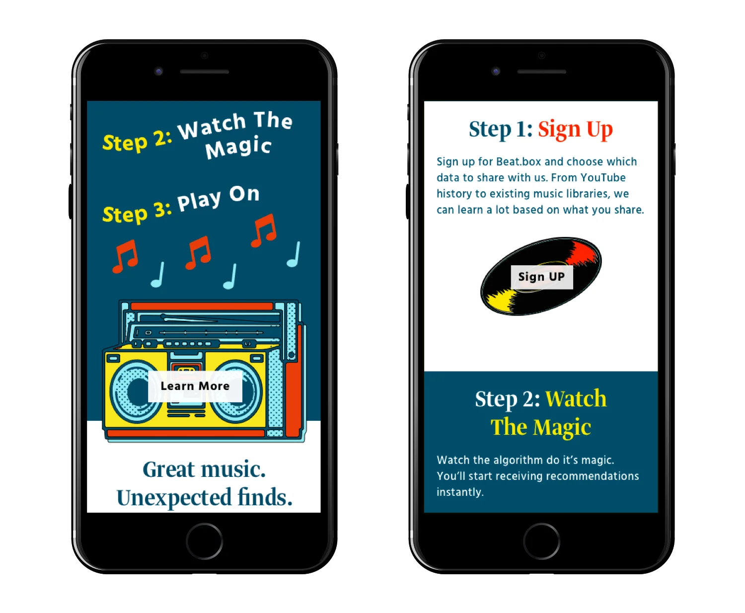
Clickable Mobile Prototype
The site conveys smart with type and color. Smart is not about flash, but being clear to create understanding. The two typefaces, Greta Display Narrow and Hind Medium, allow the message in the copy to come forward. The dark teal and white text colors are clear with a high contrast and easy to read.
Sign Up & Blog Sections

Each section is clearly defined by color and spacing with a distinct header, body, and call to action to guide the users through the site experience.
Illustrations & Icons

The illustrations and iconography are friendly with a sense of whimsy and fun. They evoke a 90s nostalgia, a formative time for the target audience, with the red, yellow, and aqua of the color palette approachable and welcoming.